Determine What Data to Collect
Beyond the basics—think first and last name, email address, and date of birth—choosing information your brand wants to capture may feel daunting. The key is to think through how you can use the data to target, segment, and personalize your communications; measure program success; and improve ROI.
Depending on your brand and the direction of your CRM program, some helpful form fields to include are:
1. ZIP code for geotargeting
2. Mobile number if you plan to implement an SMS strategy
3. Interests, symptoms, products purchased, and children in household for better audience targeting and segmentation
For those brands without access to purchase activity, proving success and ROI is a challenge. Jennifer Streck (our VP of Client Strategy) recommends asking questions to establish a baseline, then sending a follow-up survey six months later with similar questions to see the delta. She emphasizes, “You have to collect the data upfront to know what the shift is once the consumer has been in the program long enough.” Streck says brands must balance how much they want to collect with the level of friction to get consumers to complete the sign-up process. More fields, more friction, fewer completes.

“Once you’ve decided what data you want, go through each question and ask, “Is this actionable?” If it isn’t, consider leaving it off your form.”
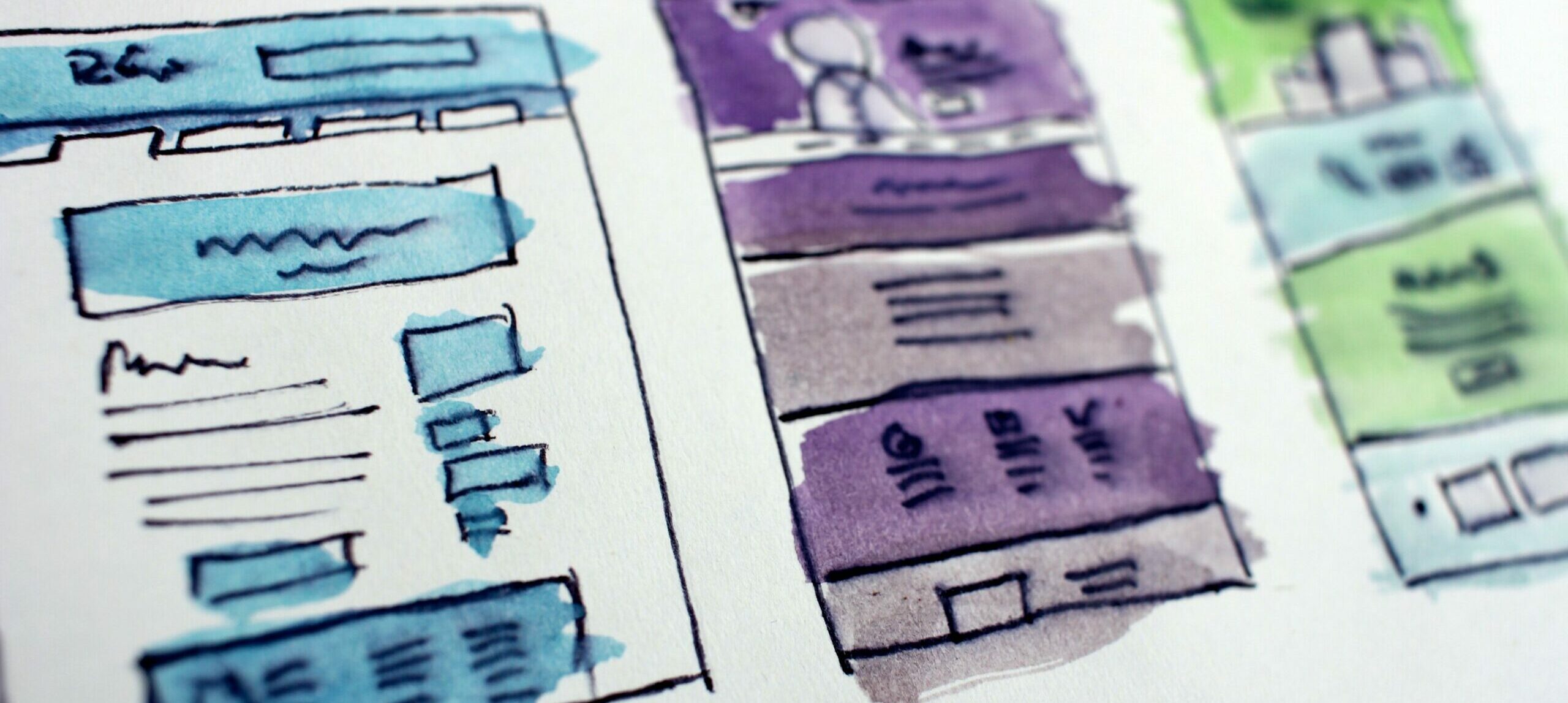
Design a Multipage Form
Unless your brand is collecting only a handful of information, a multipage form is the way to go. Start with the absolute minimum required information on page one, then collect additional consumer profile data on subsequent pages. Typically, we see a 70% completion rate on the second and third pages; however, for the 30% who bail, we’re still able to capture them as a record in the database thanks to the first page.
Heather Harshman, our Art Director, shared her top five suggestions to help make a multipage form feel less overwhelming and encourage completion:
1. Design with contrasting colors to grab attention and make it pop.
2. Include specific labels so consumers see what you’re asking at a glance.
3. Consolidate as much as you can into dropdowns and utilize checkboxes.
4. Use a progress bar to give consumers an indication of how many questions/pages they have left.
5. Make sure the CTA is clear and descriptive of the action being taken.
Another standard practice to consider is incentivizing sign up with an offer on the initial page, then upping the ante with an additional offer to complete the rest of the pages. We’re also fans of conditional questions: if consumers answer a certain way on an initial question, a secondary one appears. This allows your brand to get specific information from the relevant audience and keeps the form streamlined for everyone else.
Implement UX Best Practices

Even the most beautiful, captivating form won’t perform if you don’t implement it correctly, and 71% of forms worldwide do not comply with accessibility standards. When asked for his top recommendations, our Senior Frontend Developer, Chris Hodge, said:
- Make sure inputs are properly validated. For example, ZIP Code only accepts numbers or validates for postal codes, name fields don’t accept special characters, email is properly validated, etc.
- The form should be one of the first elements visible on the page. The user shouldn’t have to scroll much to view the form.
- If there are any submission errors, redirect or display what went wrong and allow the user to resubmit the form (or don’t allow them if they don’t meet criteria).
- Ensure a user can tab through the inputs to make it easier to fill out or auto tab if the user uses autocomplete for an input.
- For mobile devices, add specific code to number and email inputs to display a particular keyboard layout for that input, e.g., a phone number input would display only the numbers keyboard.
These elements only scratch the surface, so we recommend checking out the U.S. Web Design System’s extensive guidelines.
Next Steps
As you begin putting together your sign-up form, explore competitors’ sites and check out these 20 inspiring examples of sign-up forms to get a feel for what successful brands are doing. If you discover your team doesn’t have the bandwidth to flesh out a strategy, design the form, and implement it using best practices, feel free to drop us a line. We’ve been a data-led CRM agency for more than three decades, and we’d love to chat about ways we can help support your brand’s goals.


