Overall Considerations
Write Informative Subject Lines
The subject line serves as the first impression of your email. It will determine if the recipient finds the content relevant and whether they open your email or not.
Use an Easy-to-Read Structure
Email content needs to be assembled left-to-right and top-to-bottom. Try to avoid the use of centered or justified alignments, which are more difficult to read.
Feature Descriptive Link Text
Link text tells the reader what to expect when the link is clicked. Instead of saying “Click Here,” include context to set expectations. Consider link text such as “Click here to view more products” or “Click to download our shopping guide.”
Vision & Print Considerations
Include Alt Text
Use alt text to provide a brief description of the image and to highlight the relevance of the image to the message.
Implement Color Contrast
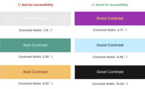
Because some subscribers are sensitive to color, the background and text need to contrast enough to be readable. It is a good idea to select a single color for text and a single contrasting color for backgrounds. This will help to ensure the content of your message is easily seen.
Take a look at the diagram below for examples of good and bad contrast ratios for accessibility.

Hearing & Audio Considerations
Use Semantic Code
It is essential to utilize header and paragraph tags so screen readers can interpret your content easily. The use of header (<h>) and paragraph (<p>) tags allow the screen reader to discern the difference, creating a more enjoyable reading experience for the listener.
Mobility & Touch Considerations
Utilize Buttons for Clickable Links
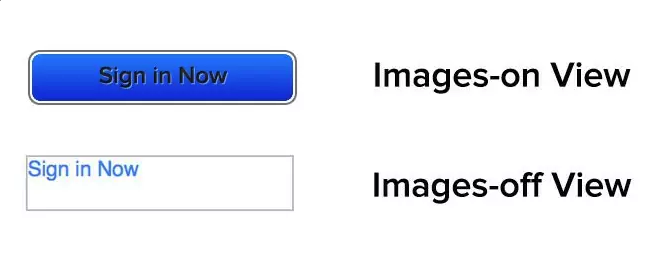
Give your call to action a large clickable button. Consider the ability to click the buttons on mobile devices using thumbs and fingers. Bonus – buttons will load even if images are turned off.
Below is an example of what occurs when image-based CTAs are in emails where images are disabled.

Cognitive Considerations
Establish a Clear Focus
Declutter your layout to ensure the focus is clear. Utilize tried and true design principles such as white space, clear calls to action, hierarchy layouts, and font styling to create an inclusive design.
Make Text Readable
Long paragraphs and walls of text are hard to read. Consider splitting long sections into shorter ones. Utilize headings to group related paragraphs and content so it is more easily digested by readers.
Accessibility Testing Tools

Below is a list of available tools to help you ensure your email content is accessible.
- Litmus Email Previews:
Litmus email testing software helps you find and fix critical elements that affect performance and delivery. Send every email with peace of mind, knowing errors won’t jeopardize your email marketing goals or put your brand reputation at risk.
- Email on Acid’s Accessibility Tools:
EoA Accessibility Precheck Resources allow you to craft emails to reach a broader audience. Millions of people worldwide suffer from some level of visual impairment; and for those users, EoA provides tools for setting up code for screen readers with alt text, appropriate contrast ratios, link accessibility and more.
- Email Accessibility Checklist:
For many businesses email accessibility is a significant concern. Use the E-Shot list of simple checks to make sure that you have the basics right to ensure that every recipient gets a great communication experience. PDF download available
- WebAIM Contrast Checking Tool:
The Contrast Checker
allows users enter a foreground and background color in RGB hexadecimal format, or by selecting a color using the color picker. The Lightness slider can be used to adjust the selected color. Requirements for a contrast ratio are specifically outlined for graphics and user interface components. - Toptal’s Colorblind Web Page Filter:
The Color Filter offers a look at your product through the eyes of those with color blind anomalies. Users indicate a resource URL, and a color filter to be applied to that resource.
- Color Blindness Simulator:
The Simulator takes checks further with image uploads at any size.
- NVDA Screen Reader:
Non-Visual Desktop Access
allows blind and vision impaired people to access and interact with the Windows operating system and many third party applications. - Ultimate Guide to Bulletproof Buttons:
More resources from Litmus, such as the bulletproof button guide to optimize your call-to-action (CTA) button that draws people in. Needless to say, your CTA is one of the most important parts of your email, and if it’s hard to find, hard to use, or broken in any way, your subscribers aren’t going to click!
In Conclusion
Accessibility concerns should be a top priority when designing and creating your emails. No matter your role in the email creation process, you can take steps to ensure you provide recipients the best possible experience, regardless of any impairments they may have.


